So I heard people were pretty excited for the results and what other people submitted. Take your time and read through our thoughts and appreciate each entry as we did. Please keep in mind that all rankings are relative. We tried at first to place some absolute grades on each picture but as all of them are really close in quality we didn’t get far. So the process was basically going through each picture one by one and asking “Is it better than X? If yes, is it better than Y? But worse than Z?”. I hope that clarifies some decisions.
All entries accounted for. Check
All jury members questioned and probed. Check
All heated arguments resolved. Check
So let’s go!
So dark and edgy the jury cut themselves reviewing this picture. Out of safety reasons we keep this separate from the other images.
Wow! Talk about a picture…
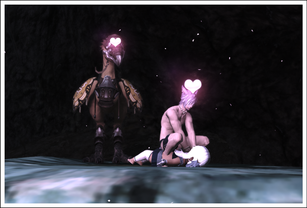
Really bad luck for Io, that we added Ryve to the jury on the 23rd. Then this picture appeared in our discussion call and was met with different levels of enthusiasm. While the long-eared jury member was still wondering how this is working and what exactly they were doing, the female jury member was going on about the clever use of emotes. In the end the most puntable jury member yelled something along the lines of “Get off my girlfriend!”.
We decided to keep it in the same safe as Malkier’s entry.
“Good execution on a very very concerning idea.” – Jury
Heavy discussions on this one. Yes, it is missing lighting. Yes, the positioning is off and the composition is all over the place. Yes, the colours are not well adjusted and contrast is just missing.
Nevertheless it was the most difficult picture to take and everybody should know that getting all the missing pieces here is nigh impossible on your own. Dreydn should receive nothing but respect for trying this. But the discussion ended with “it’s the quality of the result that counts and not the difficulty of the way”. As thus this is sadly on the 13th place.
My best advice would be to ask someone else to assist in doing combat scenes. It’s really a lot easier to have a “sparring partner”.
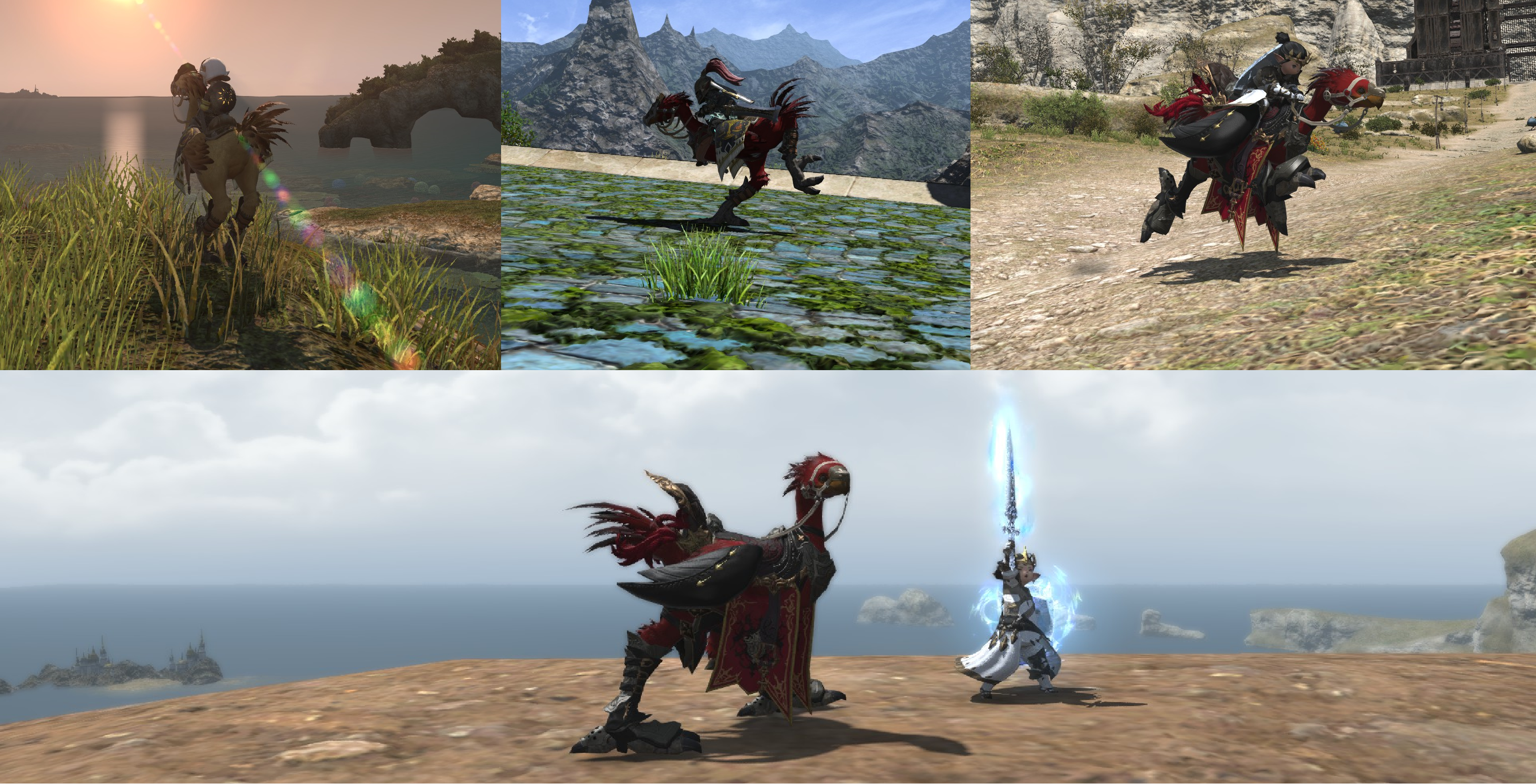
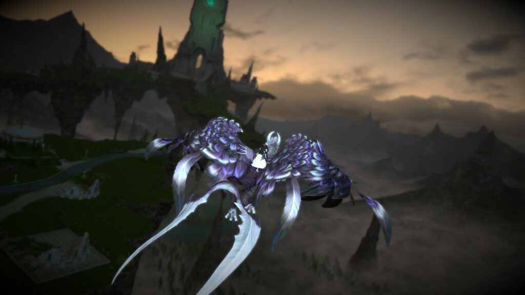
So this was a “day before” entry by Sonja and it definitely has more potential. The jury agreed that the location was well chosen and the mount really looks amazing. We just had a lot of things not working in the images favor: The mount and rider only take 20% of the image space, the rest being the landscape. You cannot see the face of the rider due to the angle of the camera. The limb darkening did not help at all, especially when looking at the otherwise cool glowing eyes of the statue.
BUT (big but) these are all things that could be corrected really easily, so the potential is there to score really high the next time, with more knowledge about what the jury likes and what the gpose tool offers.
I will personally say that I was really surprised. While we thought that the green and the purple clashed with each other and the general idea is really basic… the picture gave me that good feeling you get at an airport when you are about to travel around the world to take a vacation. That one step towards freedom, exploration and adventure.
While the execution definitely needs some work, be proud of what you created. I believe it is definitely better than your previous entry in the first screenshot contest, which just shows that your quality improved, but the competition is just really tough this time!
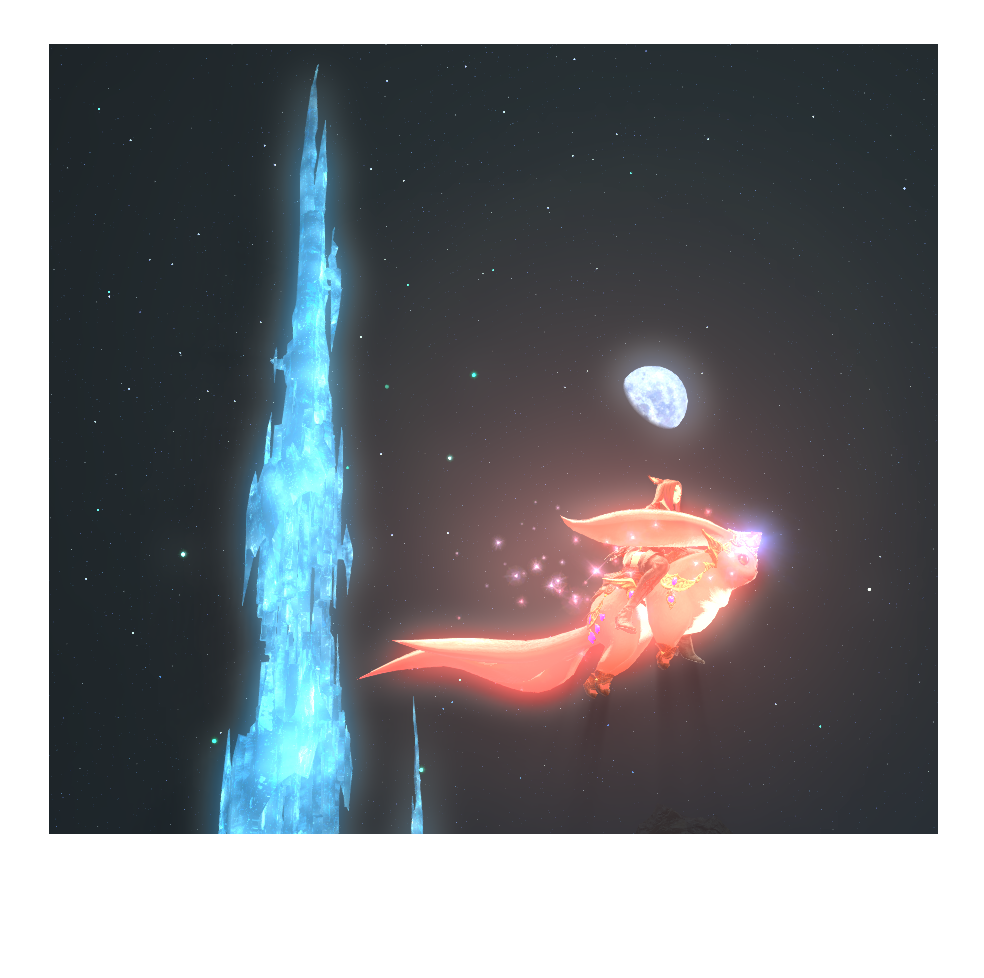
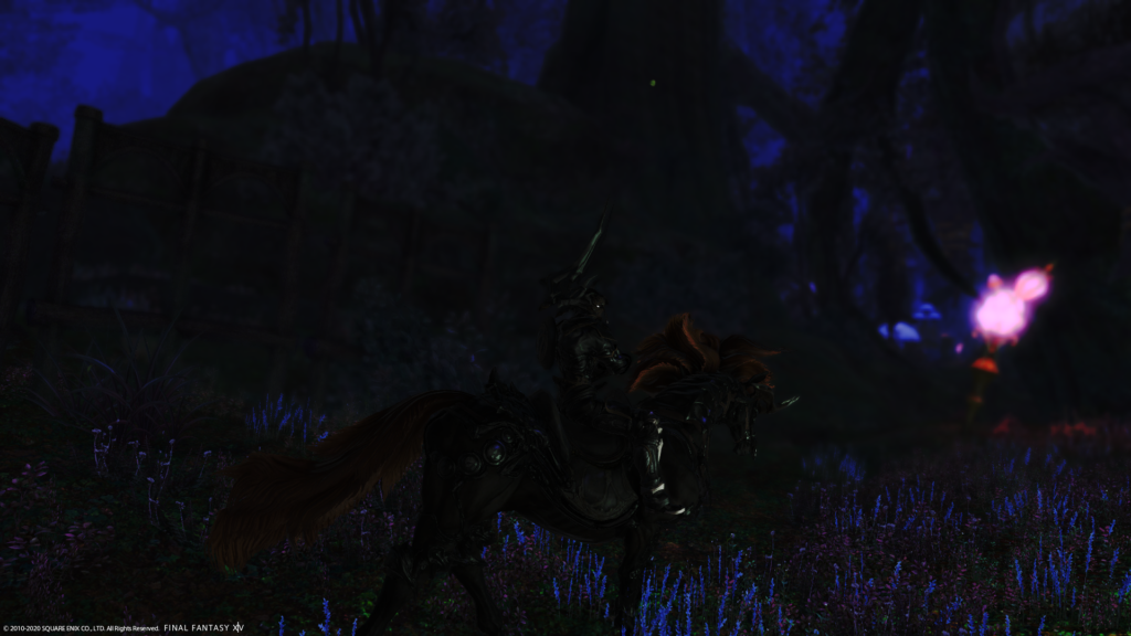
The first of the top 10 images by our rather new member Asherya. And this one was a tough to judge entry. The colours work great and the contrast is amazing. The mount suits the idea of a fairy entity passing through the night really well and the idea behind it is good. The only problem all 3 members had was… What does the author want to convey? Why are we looking at this? It feels like a tech demo for contrast more than a picture of an adventurer and his mount. Reworking the framing and positioning could have really helped fix this. Going for a wider angle and getting more of the tower while making your body and mount smaller could help the image transcend the tech demo feeling.
Definitely keep at it and try to discuss ideas and motives with other company members could really help in the future. You’ve got the technical aspect down really well!
Way better than the old entry. This gives of a cozy atmosphere with good lighting and a (for this contest) unique idea. The partner look on both is really really well done and we appreciate the effort that went into that.
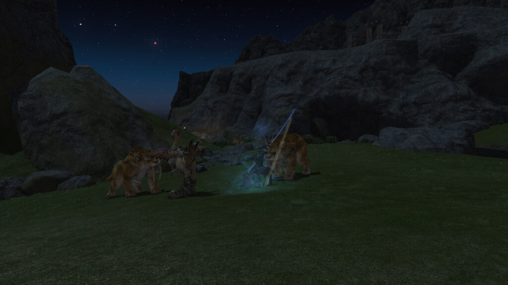
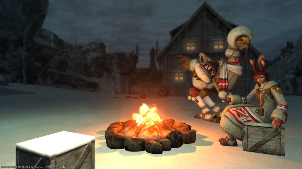
Some jury members still feel like the kid in The Incredibles (2004) though: “Waiting for something amazing, I guess.” The emote is standard and while it works it’s just not giving enough. The composition is off and there is a whole lot of nothingness on the top left side. The chocobo could’ve been placed a bit more directed towards the fire and closer to the character. I know that is hard, but practice makes perfect!
Here we see Laila’s idea for the contest.
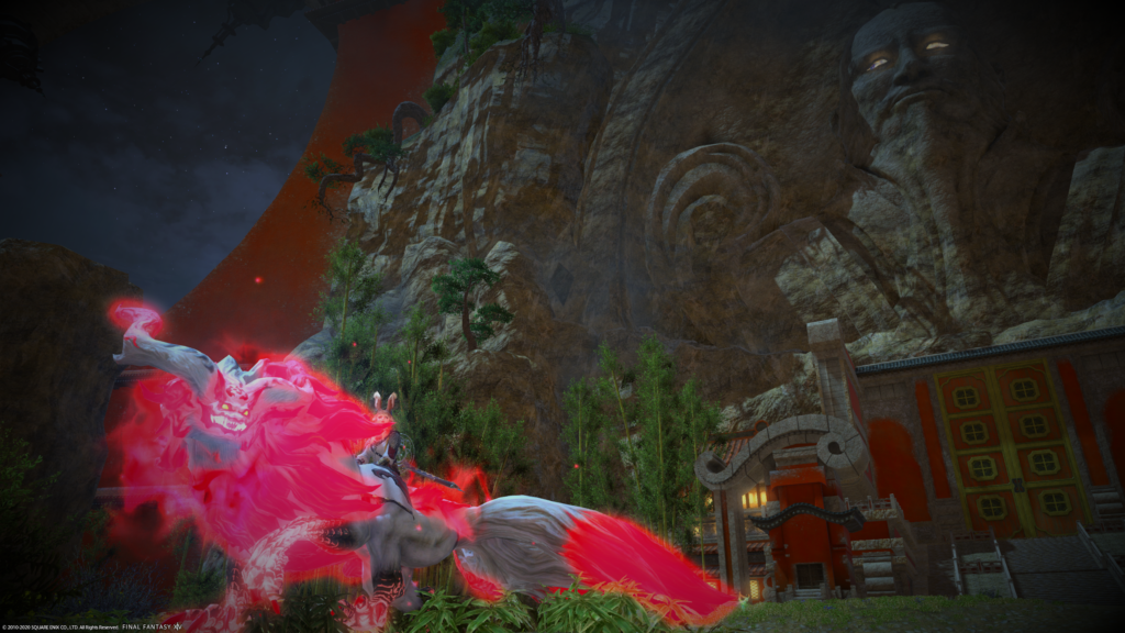
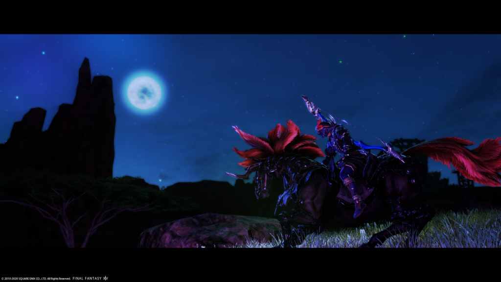
A basic idea well executed, with great colour composition, a nice positioning and a really creative usage of blue and red light. Only thing really bothering me is the fading of purple light into darkness. Might look into how that can be solved.
Nonetheless let’s be happy she is on the jury and not competing!